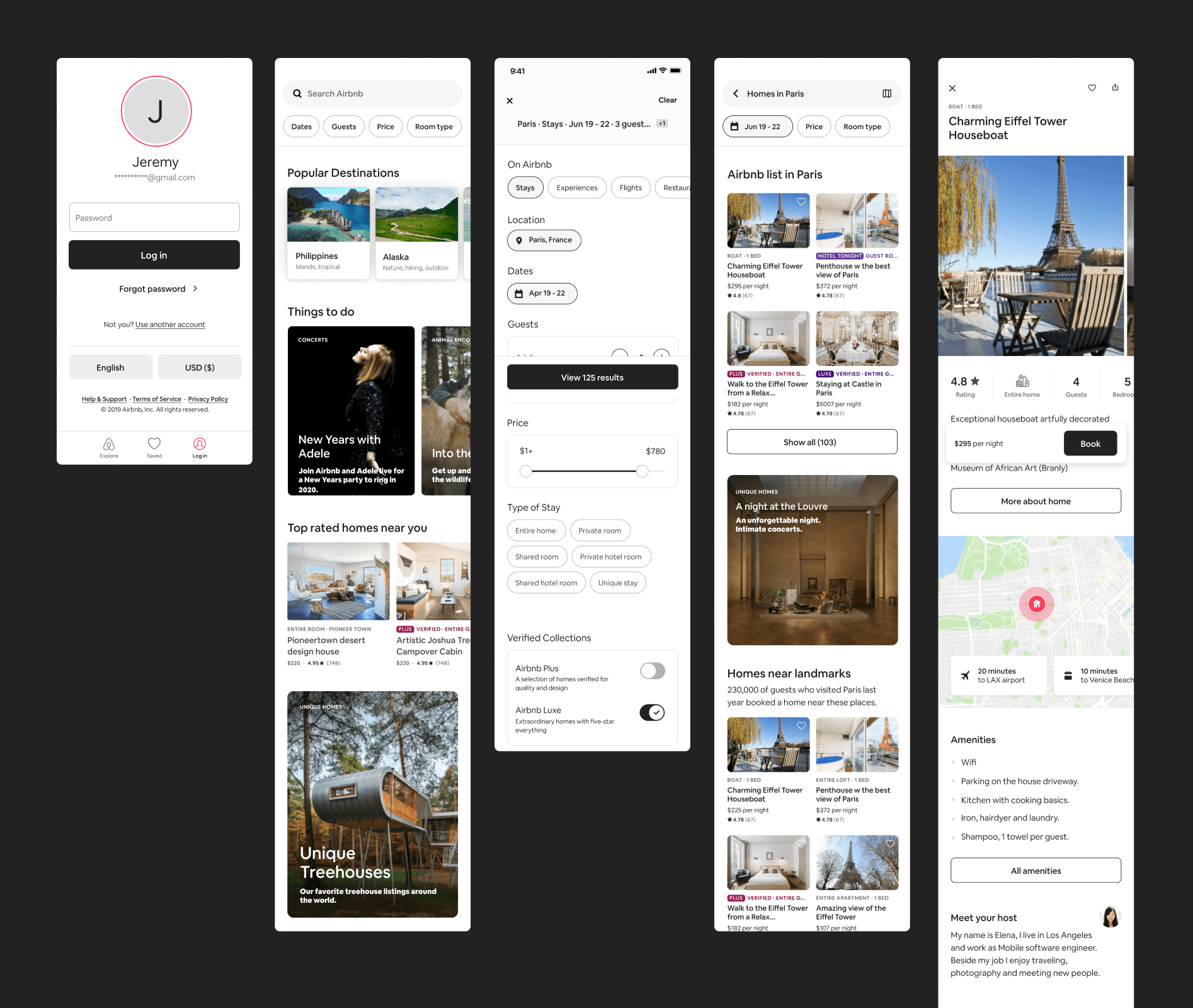
As Airbnb transitioned from a high-growth startup to a company ready for IPO in 2019, it lacked a cohesive design language that could scale across teams effectively. Designers across different verticals were largely working independently, creating separate patterns, components, and styles.
As part of DLS 19 (Airbnb's major design language redesign), I redefined forms, states, and elevation while collaborating on color, buttons, and more.
company
Airbnb
Date
2018-2019
Role
experience designer
unified, accessible, & efficient forms
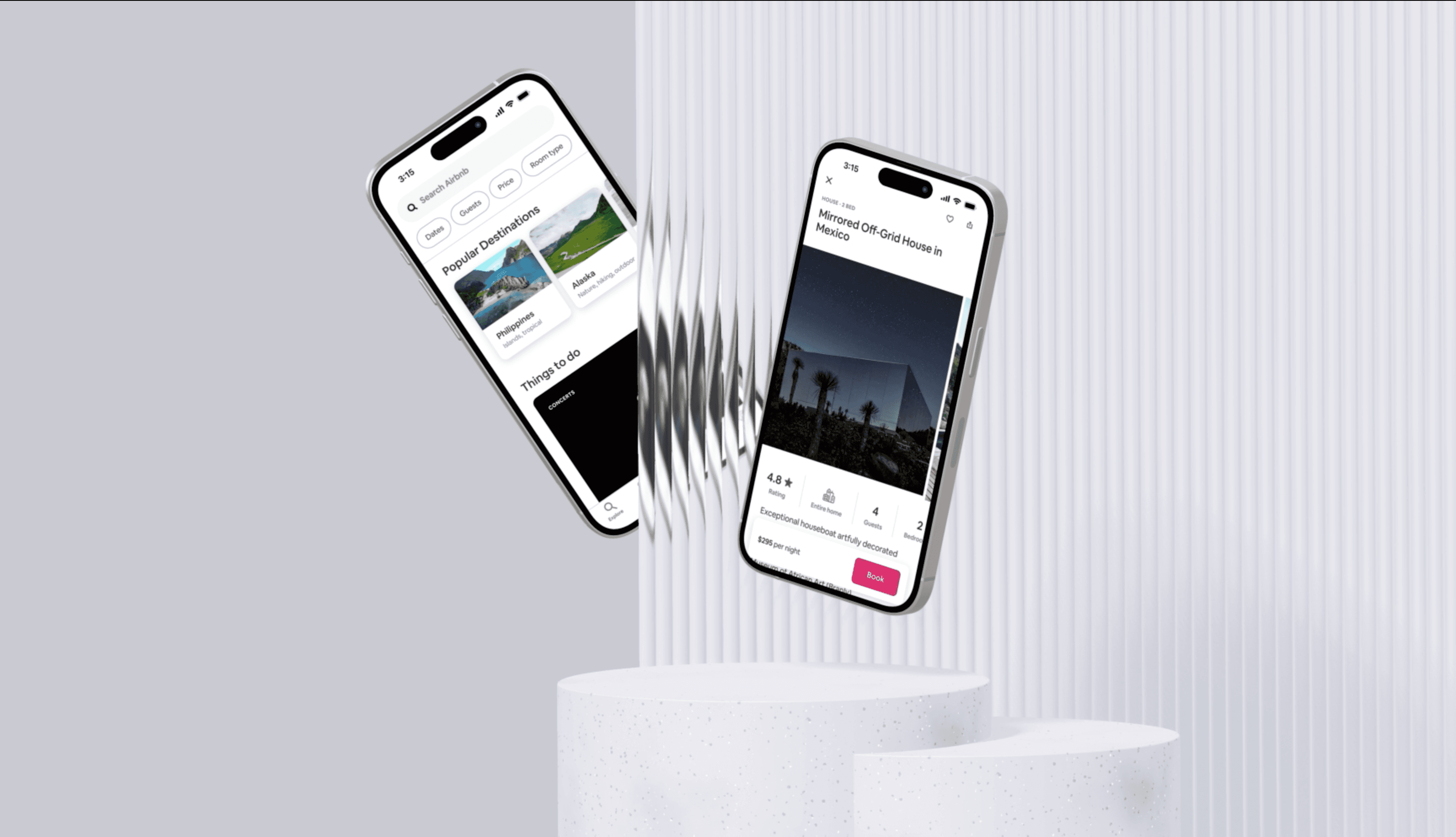
Forms provide some of the most important and interactive functions within the Airbnb product. However existing forms patterns were inaccessible, inconsistent, and lengthy (leading to drop-off).
I re-defined the entire system while adding multiple new components - creating a consistent cross-platform experience that prioritized efficiency and contrast.
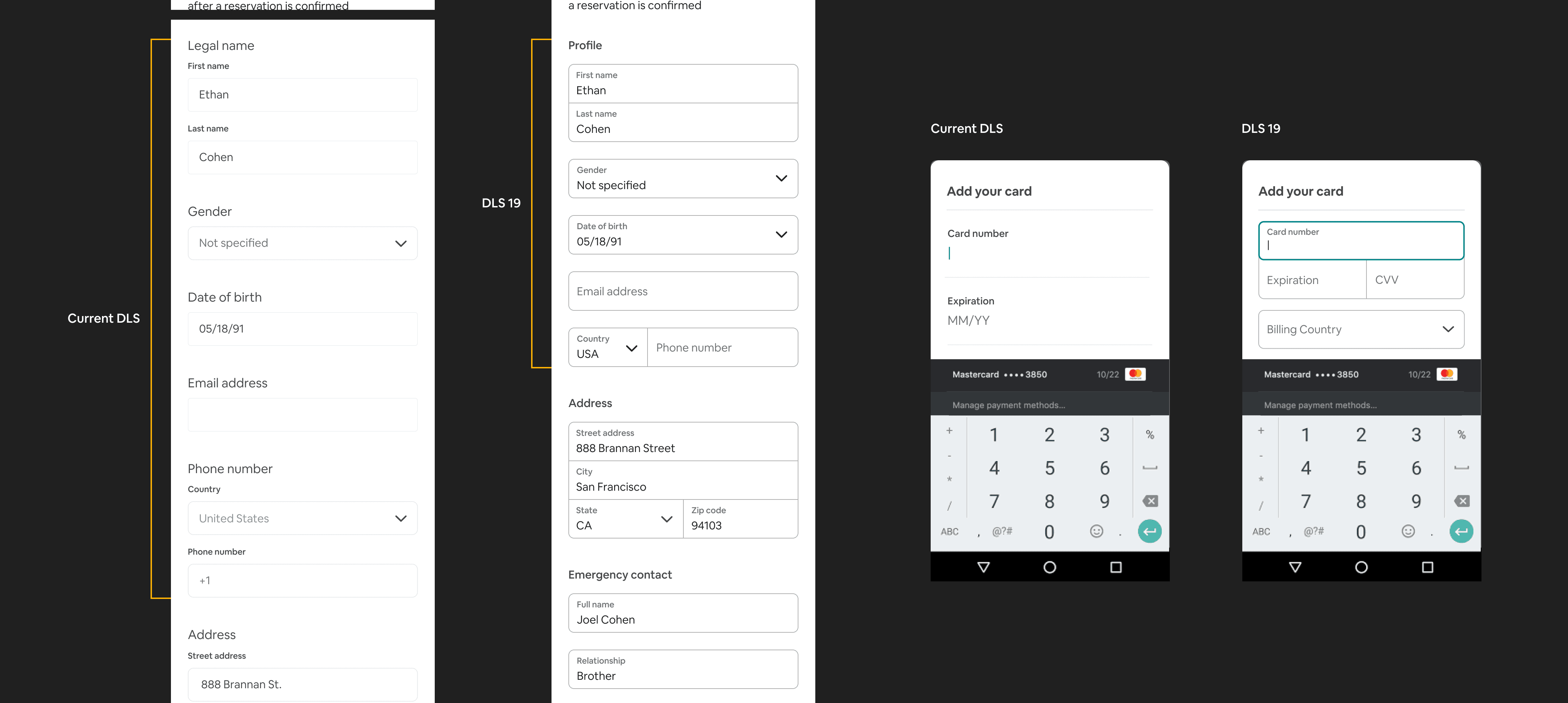
Alongside a redesign of the standard input component to include a floating label paradigm (saving important space especially on mobile), I introduced a combo input component to the system to introduce even more dramatic space saving as well as stronger visual grouping. One of many small details that I implemented in this was the selected state micro-interaction with corner rounding to not only provided delight but smoothly maintained user focus on the active input.
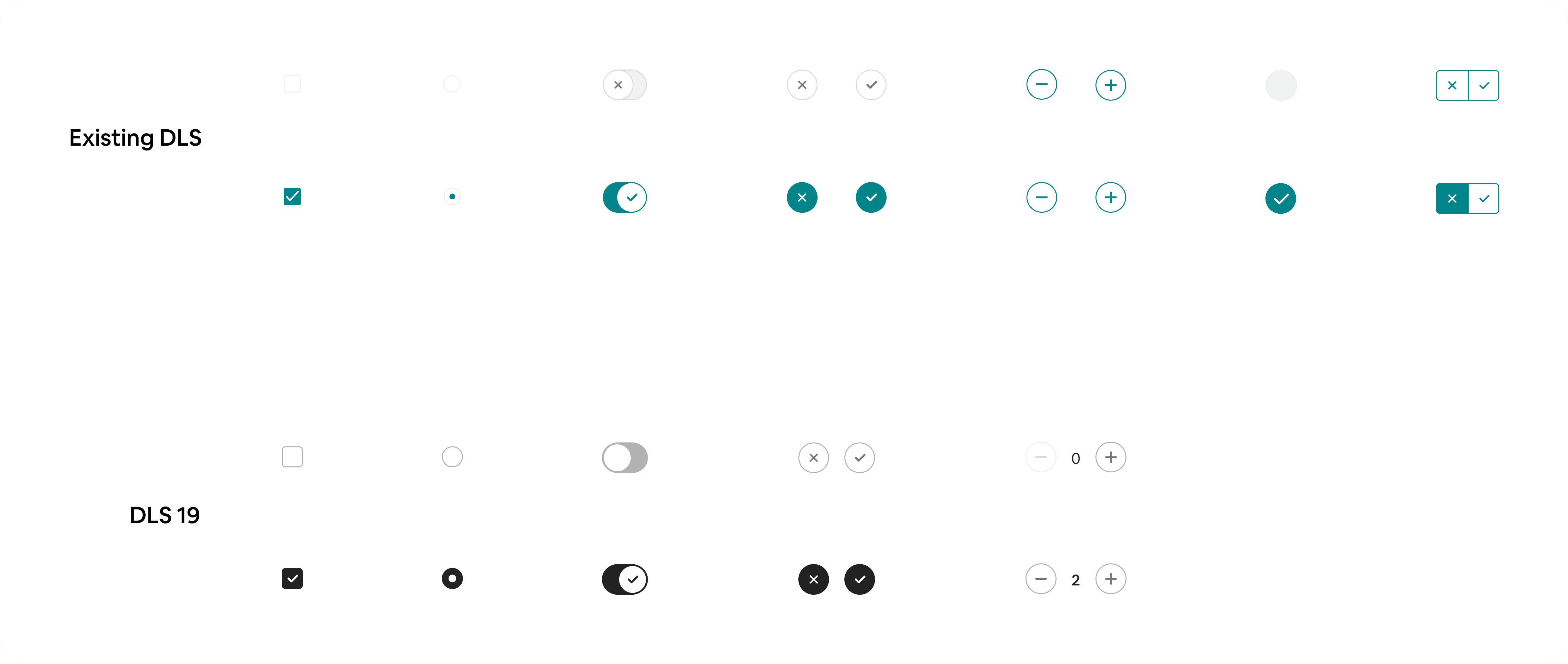
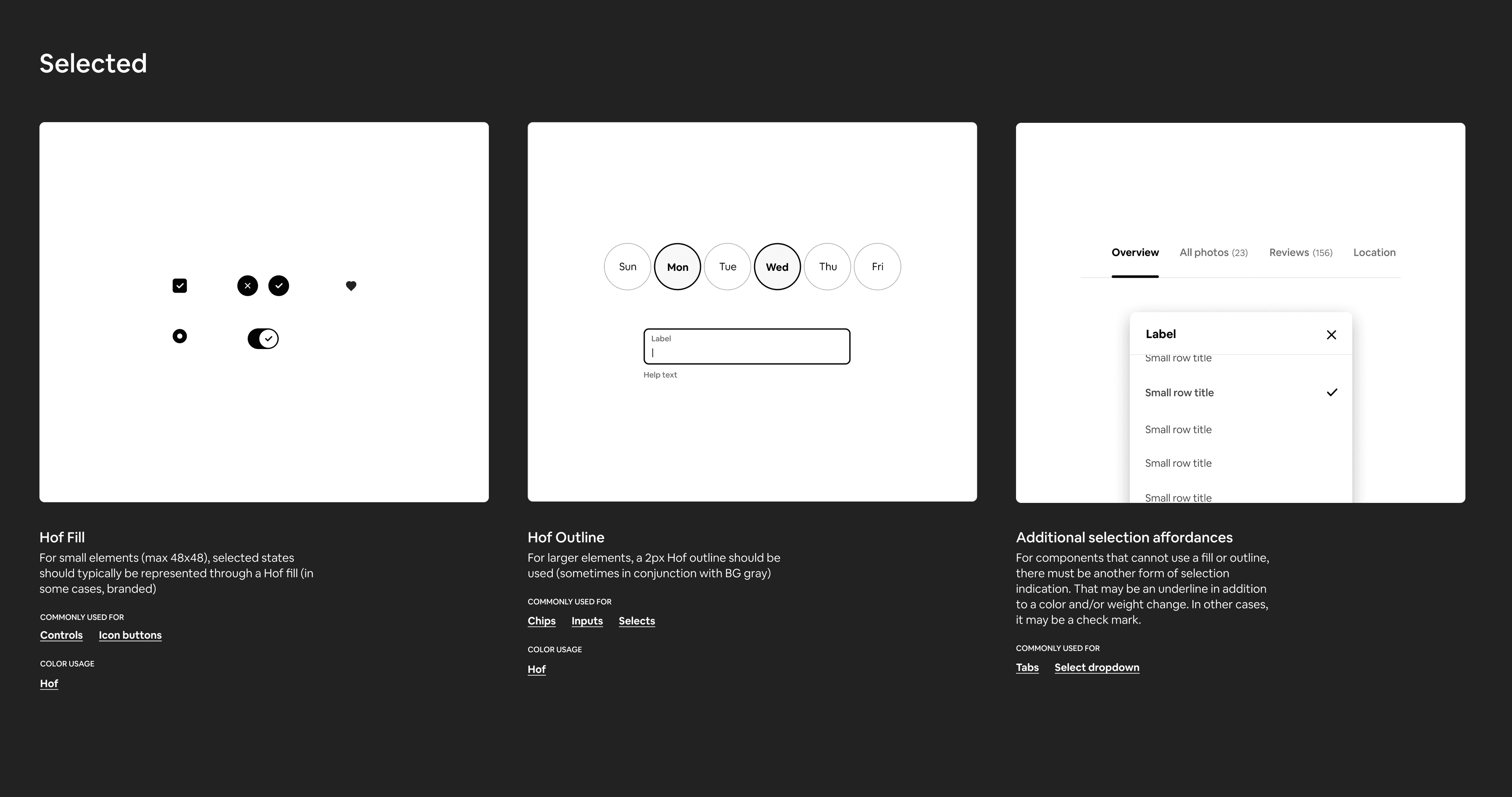
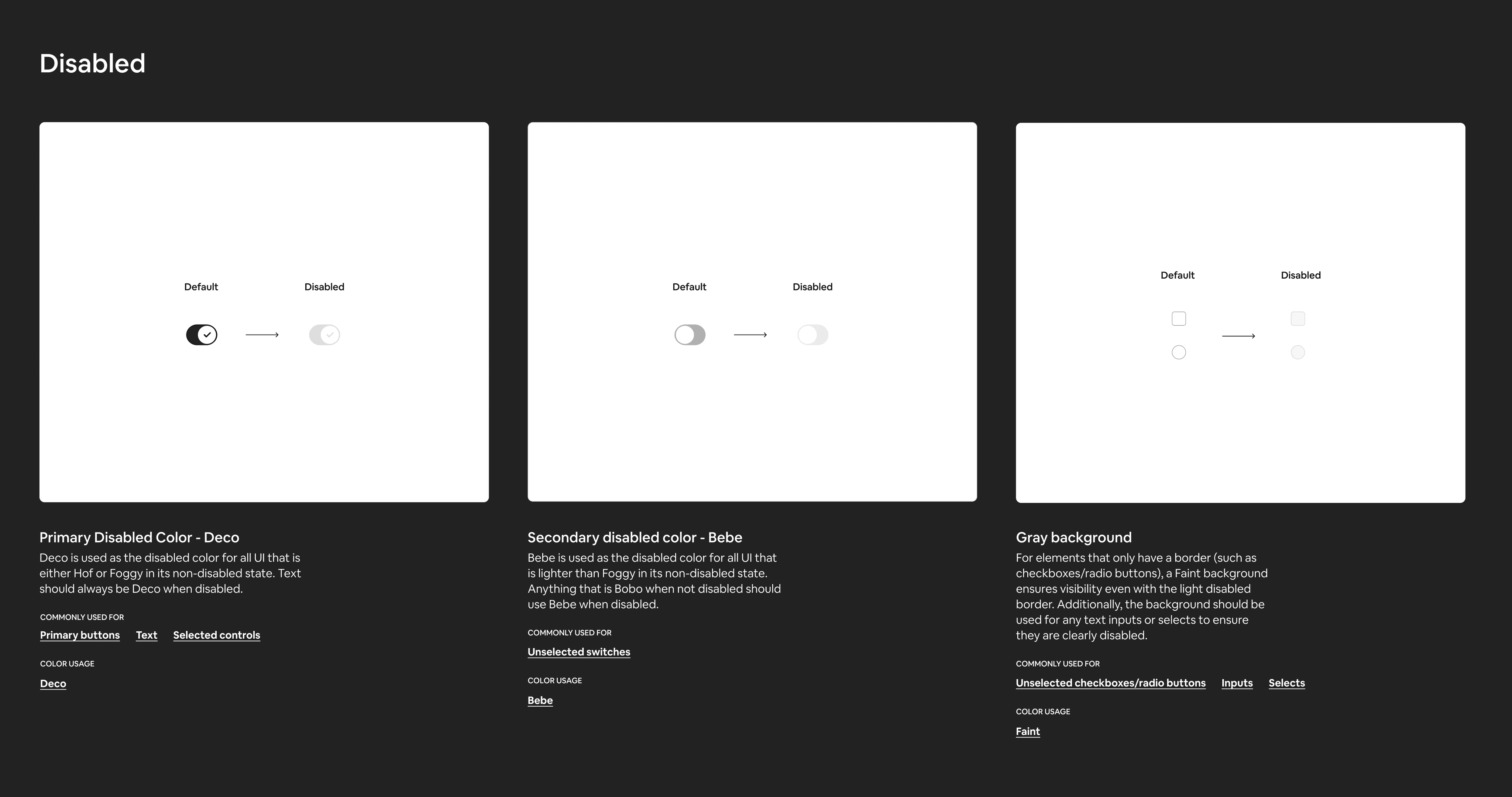
I unified Airbnb’s control set so every checkbox, radio, etc. behaves identically on web and native, eliminating one‑off patterns like tri‑state switches. Borders were updated to meet WCAG AA contrast, and a single 30 %–opacity rule standardized all disabled states (with a subtle gray base for hollow controls). States now adopted a standardized accessible gray -> Hof (black) color. I also refined micro-details, such as rounded corners, a clearer checkmark, and the removal of the “X/✔︎” switch icons that user testing showed were more confusing than helpful.
One of the new components I added to the system was chips, a more engaging and interactive input mechanism that also could condense information and conserve vital vertical space. I designed chips to be highly scalable, with variants that spanned in size, complexity, and use case while maintaining cohesiveness.
a new, accessible color system
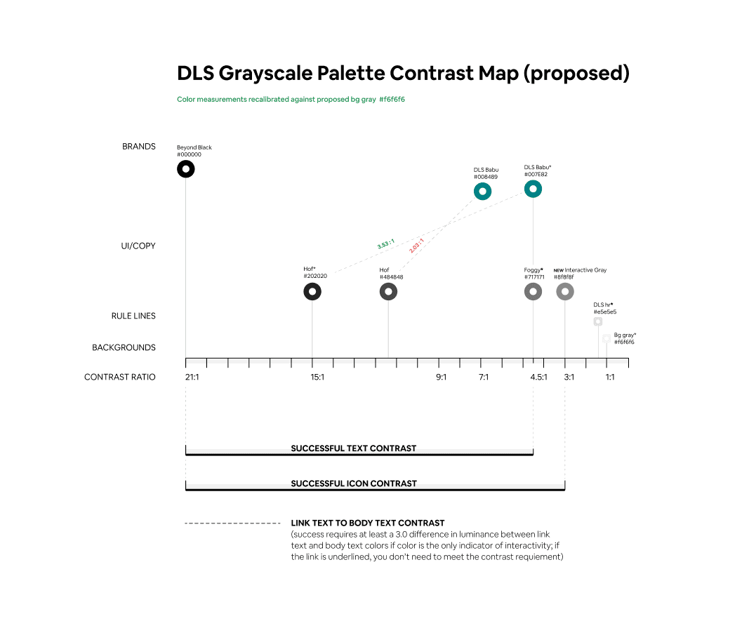
Existing controls and inputs' border colors were far off Level AA minimum contrast ratio requirements and prevented users from noticing these elements and/or differentiating from non-interactive elements.
I defined changes to numerous colors in the system in order to calibrate a fully accessible/compliant palette.
Alongside the accessibility benefits of the new darker Hof (black), I saw an interesting opportunity to re-shape the style of the product.
Airbnb’s vibrant photography and illustrations already supply rich color, so I noticed that using Hof instead allowed these to shine. By replacing the over-used Babu (turquoise) with a neutral base, we avoided clashing with sub-brands like Plus and Luxe and delivered a clearer, more cohesive experience.
states framework
I defined a framework for states based on a consistent set of patterns, including a shared taxonomy, token, and component spec for every interactive state (default, hover, pressed, disabled, loading, error). The eliminated ambiguous edge-cases, unlocked cross-platform parity, improved accessibility, and cut engineer QA time.


an ordered system of depth
Airbnb's product surfaces lacked consistent visual depth, with designers creating one-off shadows and engineers implementing different approaches across platforms. I developed a four-tier elevation system that standardized elevation values across all surfaces, from booking modals to map interface elements.
This system provides designers with clear visual hierarchy guidelines while giving engineers a unified specification for shadows and outlines. As a result, we eliminated inconsistent drop shadows, reduced visual QA back-and-forth, and achieved cross-platform parity.
